Gutenberg will be the default editor of WordPress 5.0, which is likely to be released during the 2nd half of 2018 (maybe as early as in August, according to Matt Mullenweg’s announcement at WordCamp EU 2018).
To be honest, up till this month Gutenberg has been a pretty grey area for me. I know, yes, that we all have to learn it as this tool is designated to be the future of WordPress. But I was always like “Hey, it doesn’t really look like something that’s gonna be released soon, so better not worry about it yet”.
However, Matt’s announcement has made it clear: the release date of WP 5.0 with Gutenberg is imminent. So I’d better dive into it as quickly as possible…
My first project with Gutenberg
It was fortunate that I had an ongoing project that needed some page building stuff. So I thought I would try doing the job using Gutenberg — why not? I was thinking like if it’s going to be implemented in WordPress Core soon, then it must already be usable for an average page building task.
Well, first I was a bit afraid of using Gutenberg — seeing the really bad ratings it got in the WordPress Plugin repository. Fortunately, the situation is not that bad as how the commenters describe there (isn’t it interesting? When a new paradigm is coming into our world, most of the people are against it. Then, after a while they get used to it). However, it is obvious that Gutenberg is not a mature system yet: there is still a long way to go to make it perfect comfortably usable. But if we don’t really bother about some annoying bugs and its immaturity in usability, then I can say that Gutenberg is a promising system with great potentials.
I’m not going to write about what Gutenberg is and how to use it in this article. I will instead show you what my first impressions were:
- how usable I found it,
- what were its biggest shortcomings
- and where it could be improved in terms of usability.
I’m writing here about Gutenberg 3.4.0. Hopefully these child’s illnesses will be addressed in the future versions.
First sight
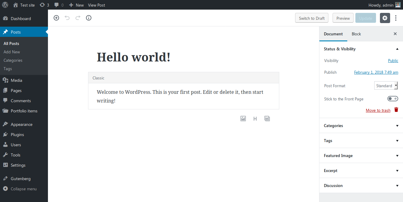
After I installed the Gutenberg plugin I went on to edit an existing post. Here is what I saw:

As you can see it, the old content is put inside a Classic block. In my opinion this is a great idea, because it keeps your previous formattings. This way it’s not likely that Gutenberg will ruin your previous contents and layouts (however, it may as there are millions of different WordPress setups out there). Also, I really like its look and feel, writing using Gutenberg has more like a feeling of “Creating”.
The new editor area is a lot narrower than in the old (Classic) one. This is comfortable as it’s easier to write if the 2 ends of a row are not miles away from each other. However, this narrowness was really annoying when I tried to make a multi-column layout.
Columns, yeah!
I really like this feature. I can create multi-column sections that usually can only be found in premium page builders. However, it’s not yet as advanced as WP Bakery’s page builder nor as SiteOrigin or Elementor. Actually, it had a feeling like I’m playing around with a child’s Lego after using some real tools before.
While columns is a must-have tool in 2018, it feels that it’s still very much in the Beta stage in Gutenberg (at least the Gutenberg creators added a beta sign to it – thankfully). The main issues with the current setup are:
- If you increase the number of columns, then everything is OK. If you decrease it, the last column simply gets erased, without warning. OK, you can undo things, but shouldn’t it be more usable if it went into a new row where I could erase it when I wanted to?
- There is no way to have only 1 column. However, it would be really useful if I wanted to put several elements below each other inside a container.
- It’s really difficult to position your mouse pointer in a way to focus on the columns container. I had to find those 1-2 pixels where it became active… Which is really annoying – especially if you think about web accessibility (not everyone is capable of positioning precisely with a mouse!)
- Narrowness of the editor, again. I have a 1920px wide screen but had to edit everything in a 600px wide box. I know, there is a way to adjust it somehow in functions.php, but I’m writing this article from a power user’s point of view… It would be so great to have a setting for it inside WP-Admin!
HTML markup: why I really love Gutenberg
 Unlike the premium page builders which use either shortcodes or a complicated markup to build up page structures, Gutenberg keeps the markup as simple as possible. This is good because it gives your content higher level of portability when switching between themes.
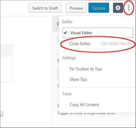
Instead of shortcodes, Gutenberg uses HTML comment tags to detect the special settings for the different blocks. You can view this markup if you click on the Three Dots (More) button in the top right corner of the editor and select the Code Editor option.
After this switch you can see the page’s actual markup, which is something like this:
As you can see, there are the wp:heading and the wp:paragraph HTML comments around the Gutenberg blocks, while the real markup is kept as simple as possible.
Using your old shorcodes
Gutenberg has a block for inserting good old shortcodes into your pages. However, I found this block type quite useless in its current state. It is a way better option to just create a custom HTML block and put your shortcode there, because that way you can encapsulate the shortcode in container elements — making it possible to add extra formatting or ID anchors to them.
Cover Images
Cover Image is a really great block type. Many modern web pages use the feature to have a wide image block with some heading text on them that separate the different sections of a page.
However, the current version in Gutenberg has 2 big shortcomings:
- The text on the image uses a P (paragraph) HTML element. In most cases these sections contain important titles, so it would be a lot better option to have the possibility to use H1 .. H6 headings in these sections – for the sake of SEO.
- No ID tag / HTML anchor possibility. This is a very big weakness of the Cover Image block (and almost all other block types in Gutenberg). In the everyday practice this kind of element is often used for separating different sections of a document. So not having an option to add an ID attribute significantly reduces its usability.
HTML editing the blocks
Fortunately if you are not satisfied with a block’s HTML output, you have the option to edit its output as HTML:
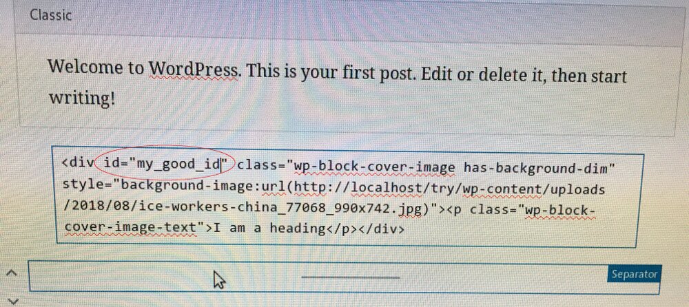
OK, let’s try to add an ID attribute to it in the old-fashioned way:

I though first that I was smart and managed to add my anchorable ID this way successfully. However, the next thing I saw was this – right after clicking outside the HTML block editor:

If I chose Convert to Blocks, my block was converted to a simple Paragraph block. So Gutenberg forgot that I was originally editing a Cover Image block. Moreover, it didn’t maintain my custom ID attribute, so it wasn’t a good option to convert back into a block.
The other option was to Keep it as HTML. In this case I lost the improved UI of the block. It’s not a good idea if I ever want to give the editing of this page into the hands of my client as he doesn’t know how to code HTML.
So if you want to add HTML ID attributes to your elements, most of the current Gutenberg blocks aren’t your friends.
Conclusion
Gutenberg was good enough to do what I wanted to achieve with it. But in some places I had to use very hacky solutions which were very far from what our end clients expect in terms of usability. And I’m not sure that I would be able to replicate all the page layouts with Gutenberg that I had built before with more mature page building tools.
For the current version I would give Gutenberg 3/5 points, but it can easily improve if the creators fix the following things:
- Enabling the ID attribute for all block types
- Making it possible to use 1-column layout with the columns element
- Ironing out the usability glitches – like the need of 1-2px precise positioning to reach some elements with the mouse
- Better portability of HTML elements between the visual and the HTML editor mode (even if I add some custom attributes in HTML mode)
Hopefully we’ll see great improvements in the next versions, because Gutenberg looks like an editor with great potentials. However, I have a feeling that we are going to switch back to the Classic Editor often after WordPress 5.0 is released…


I installed it yesterday, using the link that appeared in the WP dashboard blurb. It immediately made every page on my site inaccessible — just by activating it! I de-activated it rather quickly, after verifying that all my content had become invisible to viewers, and all returned to normal — but the current version is definitely not ready for public usage!
There are these wp:whatever for all blocks. Does normal wordpress search exclude these “comment” words when searching in content?
Very good question!
I’ve just tried how it works inside WP-Admin (the site I’m working on doesn’t have a front end search).
And the Search tool in WP-Admin » Pages found the term “wp:heading” in my Gutenberg articles.
Good point, perhaps the next WordPress versions should have a filter to exclude them from the search?